
Your Guide to Image Optimization
Since our educational adventure at An Event Apart in Washington DC this past July, we’ve discussed Website Accessibility and Measuring Engagement. Today, we’re diving into the ever-important realm of Image Optimization.
What is Image Optimization?
When Una Kravets, UI Engineer for Digital Ocean, began her AEA presentation with a full screen photo of Bob Ross, we knew this was going to be good. Essentially, Image Optimization is what makes a raw, high-resolution photo or graphic look good and load fast on the web. This is accomplished using various tools and practices, which we’ll get into later. Worth noting, we aren’t necessarily talking about the physical size of an image in inches or pixels here, but instead the file size in bytes.
Every time you visit a web page, your computer is essentially downloading the embedded images to view them. This consumes precious bandwidth on your hosting environment as well as your visitor’s browsing device. The goal of image optimization is to minimize the bandwidth required to experience a website.
As Google so eloquently puts it, “Image optimization is both an art and science” because there is a definitive yet subjective balance between quality and file size. In the example below, you’ll see our original photo on the left, straight from the camera, with zero compression or optimization. To the right, that same photo has been saved at 10% quality to significantly reduce file size.

With any image optimization, there is give and take. The higher the quality (more colors, finer detail) the bigger the file. There have been major strides in lossless compression that retain the depth and variation of photos. Such methods rely on extremely complex algorithms unique to each of the popular file types (JPG, GIF and PNG). Painting happy trees might make us smile, but image optimization is serious business.
Why it Matters?
You might ask yourself why this extra effort is necessary. You have a nice broadband internet setup at your house, so why bother with a saved kilobyte here and there? For that answer, you’ll have to step outside of your own home. When Una Kravets refers to “Responsible Imaging,” she’s talking about serving all audiences, across the world, on any devices, with a wide range of connectivity scenarios. Like her, if you believe access to information should be a basic human right, then image optimization becomes a top priority. If we look at mobile traffic alone, about 50% of all visitors are using a phone or tablet to browse your website – often from a 3G connection. Statistics show that 53% of mobile sites are abandoned after just 3 seconds. Can you afford to lose that much business due to slow page load times?

Additionally, search engines like Google are starting to place increased importance on page load times. Websites that load faster rank higher in search results and that will only become truer as expectations evolve. Just for fun, check out your current Google Page Speed Score.
According to Una’s HTTP Archive data, nearly 66% of a site’s total size is comprised of images. Stylesheets, scripts, HTML code, and fonts are barely a sliver on the pie chart compared to the bandwidth consumption of graphics and photos. Look around at the current trends in website design. Pages are adapting large, full-width images and big, bold graphics throughout for an impactful brand experience. With this movement comes an increased need to keep quality up and file size down.
How Image Optimization is Done
It’s best practice to get into the habit of optimizing your graphics before uploading. Again, there are a handful of great tools and software to make it happen, but it often requires a human touch to get just right. Starting from scratch is one thing, but optimizing a website that is already established and packed with images can be a real challenge. Doing so in a creative, innovative way is a whole new level of complexity. Luckily, ACS Creative is always up for the job…
Take a webpage we built for our client, B-FOR. The company provides international trade show and exhibit services. We designed their original website, and we recently expanded the site to include their Brand USA content. Brand USA encourages international travelers to visit the United States.
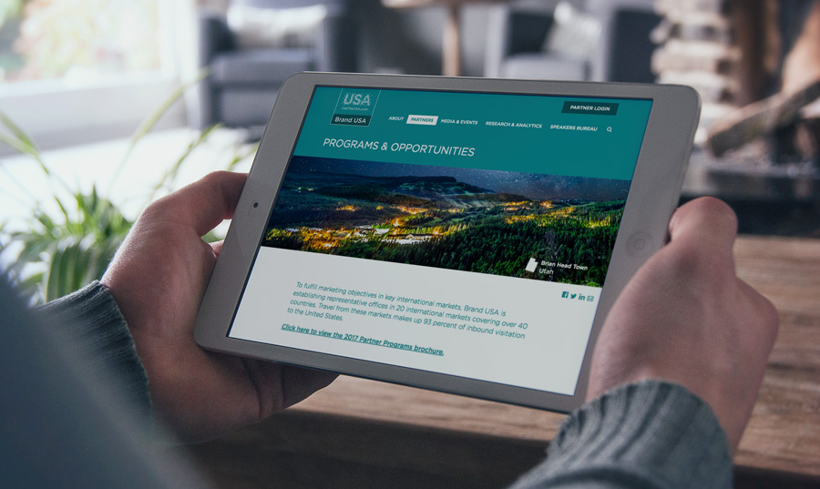
On one of the new Brand USA pages, we included dynamic images. Each time the page loads, a new header image appears. Normally, this would slow down a webpage. But we changed the typical way an image loads. The full image does not load all at once. For a split second, the image is blurry. This allows the rest of the page content to load, while the rest of the image catches up. Customers can see the content they need right away, without waiting those extra painful seconds for the page to load.
Optimizing the images on your site doesn’t always mean crunching the file size. Replacing icons and simple graphics altogether with web fonts is also an effective measure. Furthermore, uploading images that are no larger (in pixels) than their use on your site is equally crucial. For example, your logo file doesn’t need to be 900px wide if it never appears larger than 300px wide. Don’t serve an image that could be a font and don’t serve an image with unnecessarily large dimensions, and you’re already off to the races with your optimization efforts!
Tools of the Trade
Over the years, we’ve utilized several means of image optimization. Here are a few of our favorite tools and resources:
- Adobe Photoshop (software)
- Photoscape (free software)
- Ewww Image Optimizer (WordPress plugin)
- WP Smush (WordPress plugin)
- Optimizilla (web interface)
- TinyPNG (web interface)
- Kraken (API)
These will get you started, for sure. When experimenting with different image optimization services and settings, it’s important that you save the original graphic files separately. If you opt to utilize one of the WordPress plugins, be sure to backup your site before running any automated functions.
The Future of Image Optimization
Perhaps the most engaging element of Una Kravets’ presentation was her excitement about how far image optimization has come – and where it’s going. This fascination extends far beyond the current capabilities of common file types, but is also stunted by the limitations of cross-browser support. For instance, the WebP file format, which boasts transparency, better compression than JPG, as well as animation, or the Picture Element fallback, which controls responsive images based on the visitor’s resolution. WebM promises stunning open video compression with minimal loss. These are just a few examples, of course. The future is bright for image optimization, and we intend to remain at the forefront of progress.
We’d like to thank Una Kravets (@una) for inspiring us to share this fascinating topic with our readers and clients. Be sure to follow her for wonderfully whimsical insights on digital marketing, community building and technology.