
Why aren’t My PPC Landing Pages Getting Results?
Content That Kills Conversions
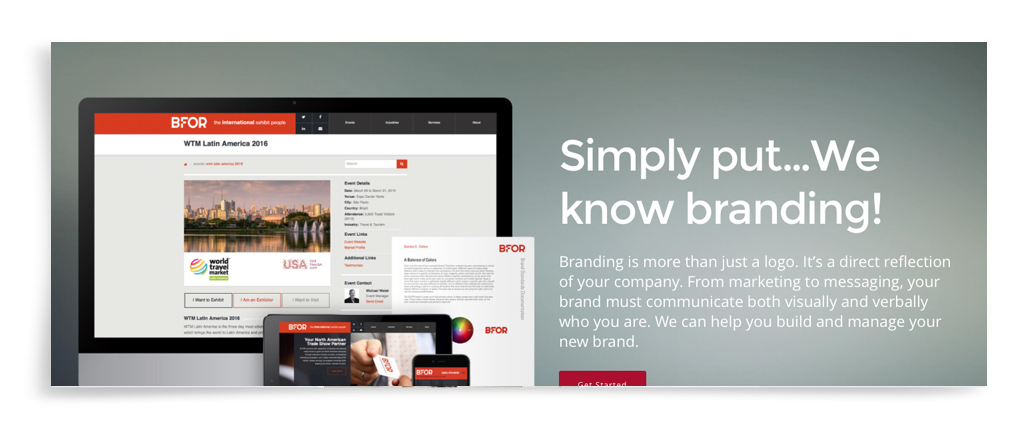
Imagine a PPC management company has your ads getting great click-through rates. But visitors only get as far as the landing page, and then leave. What’s happening? In this article, we’ll leave aside all the technical possibilities, such as slow page load and poor formatting for mobile devices (although you should certainly investigate them), and focus on the words and pictures that make up the content of the landing page. ACS Creative offers a dedicated team for our landing page design services, Below are some tips that we compiled, that might help your struggling landing page.
The Message
The disconnect between the ad and landing page messaging.
A surefire way to cause instant distrust is to promise something in the banner ad and not deliver it on the landing page. An example of this is a Consumer Reports PPC ad that offered a free downloadable report, but there was no way for visitors to obtain it on the landing page.
Using the same keywords in both places will ensure that your messaging is consistent and relevant. In fact, a MecLabs Institute study found increases in conversion rates of up to 144% when this was done. Added bonus: keyword consistency will also improve your SEO/SEM quality scores.
Too long or too short.
There’s conflicting opinion as to whether a landing page should be long or short. The conversion numbers support the short side of the argument; one expert says landing page copy shouldn’t exceed 200 words. But sometimes you just need more words to make your point, especially with big ticket items.
So the best advice we can give you is to make sure every word on there is really necessary. Which brings us to the next potential problem with your landing page content.
Excessive copy.
Attention spans are short; you have at best three seconds to convince your reader to take the next step. Verbose copy with lots of generic adjectives (“incredible!” “beautiful!” “delicious!”) won’t help sell your product or impress anybody. It will only cause them to lose patience and wander off.
Go back over your copy and remove anything that doesn’t directly support your selling points or promotional offer. Then weed out any repetitious sentences that make the same point in different words. (“This beautiful home is situated right on the lakefront. With its prime location, it enjoys magnificent lake views.”)
Too many messages.
The landing page is not the place to cram in every aspect of your business. Cluttering it up with multiple messages has the same effect as a room full of people all shouting to get your attention: you don’t hear any of them.
The purpose of a landing page is to get visitors to click over to your website (or whatever action you want them to take). One to three strong messages will accomplish this far better than a confusing mishmash.
Copy focuses on features, not benefits.
Face it, your prospective customers don’t care how great you are. They only care what benefit they’ll get out of doing business with you. In an often-cited Macy’s split test, two ads were identical in every way except for the headlines: one said “25% Off Boys’ Coats” and the other “25% Off Boys’ Coats to Keep Them Cozy & Warm.” The “Cozy & Warm” ad outpolled by 40%.
Go through your list of product/service features, imagine your customer saying “what’s in it for me?”, and put down your answer. Now you’re in a good position to persuade your readers, not just inform them.
The Visuals
Generic photos.
Do they really support your unique selling proposition? Or do visitors see an image of two businessmen shaking hands that you bought from a stock photography site? If a photo is going to take up valuable real estate on your landing page, it should do more than just look pretty. On the other hand, a generic image is better than no image!
Visuals compete with the message.
Even if your product is sold primarily on the basis of its appearance, the image should not be so big or so placed that it pushes your selling copy and call-to-action into a subordinate position. Remember, what you want from your landing page visitors is action, not admiration.
Also, be careful about the type and/or page colors. Nothing is more headache-inducing than trying to decipher purple text on a black background. Keep it clear and simple for your readers by making sure the text is high contrast and easy to read.
Grey text.
Studies of reader behavior have shown that long paragraphs of plain (“grey”) copy are frequently avoided. Maybe it reminds people of school textbooks! Make it easy for readers to scan quickly through your copy by breaking it up with headlines, subheads, and bullet lists. In particular, your customer benefits should really stand out, either in boldface type or bullets.
Call-to-action doesn’t stand out.
This is the single most important element of the landing page. It’s where you tell the visitor what to do next (go to your website, sign up, call you, visit your physical location). In other words, it’s the conversion. Your visitors need to see it within three seconds of arriving at your landing page.
Here are some ways to make your call-to-action stand out:
- Move it above the fold
- Repeat it if the page is long enough to require scrolling down
- Make it bigger
- Differentiate its colors and fonts from the other landing page elements
- Make it more motivating, i.e. “free consultation” instead of “visit us”
The Visitors
Too wide an audience.
As a PPC management company we know when you try to appeal to everybody, you convince nobody. Increase conversions by targeting your best prospects: those who actually need your products and services and aren’t just there for the free incentive. Design and write your landing page so that those time- and money-wasters screen themselves out, and you’ll have more resources to devote to high-quality leads.
This is why you might want to think twice about offering a free giveaway in your PPC ad just to get click-throughs. Some companies are even experimenting with asking leads to pay a little something to start the conversion process, perhaps a small fee for a personal consultation. Landing page conversions may be lower, but sales results might be higher.
The offer is too complicated.
Making people do math to figure out how good a deal they’ll get is essentially demotivating. Amazon makes it easy for its customers: on every product page, you not only see the percentage of the discount, but also how many dollars you save and what your final cost will be.
Rather than a discount, you might offer something like a gift with purchase or free shipping. “Free” is historically the most powerful word in advertising and will outperform any discount or rebate offer.