Silicon Valley Start-Up Launches New Website
We all know the lore around Silicon Valley. The ambition, the technology, the ultra successful start-ups. But we don’t always think about how companies start in Silicon Valley, before they make it big as household names.
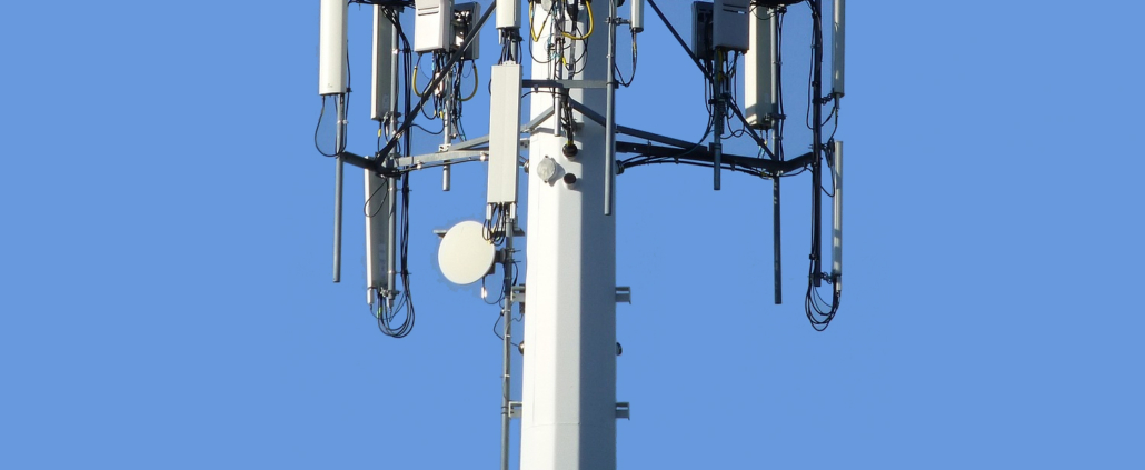
We are fortunate enough to work with one of these emerging start-ups, Eridan Communications. The company is developing transmitter technology to enhance 5G wireless networks. (It’s all pretty complicated, for people like us outside of the industry.)
Getting an inside look at a Silicon Valley tech company, we were excited to help Eridan launch their new website. The site includes miles of information. It guides potential investors through different products and technology, encouraging them to get on the ground floor of Eridan’s journey.
Seeing Double
Eridan’s founders have been in the start-up game for a long time. In fact, their company InnerProduct Partners (IPP) helps new start-up companies raise funds. We developed the IPP website, and we were eager to design Eridan’s website too.
Whereas IPP had a fairly straightforward website, Eridan’s site needed to show the depth of their technology to potential investors. That means there was a lot of information to show off. Unfortunately, website navigation bars only stretch so long.
It would be impossible to cram all of the sections and topics into one, easy-to-read navigation menu. To solve this problem, we decided to add a second navigation bar. Two navigation menus is a little outside of the box. It’s also a great solution to information overload.
The top horizontal bar has standard information about the company. A second navigation bar runs down the left side of the page, and it links to detailed information about Eridan’s products, markets and technology.
There Be Dragons
Once we had the navigation menus set up, we had to organize the rest of Eridan’s detailed information. We applied the strategy we use for most websites — glance, scan, read, study. People absorb information differently and at different times. Some people just want to skim past pages (glance, scan). Others want to dive in deep (read, study).
We structured information on Eridan’s website to accommodate all types of information seekers, the scanners and the studiers alike. For each of the sidebar sections, we started with an initial summary page. People can scan these pages for a quick overview of what’s in store, before diving into specific markets or technology details. These smaller chunks of information help prevent visitors from feeling overwhelmed by walls of text.
Some technicians or investors will want more information, of course. They have the option to click through to more detailed internal pages on the website. For the most technically minded visitors, they can even read in-depth reports on physics and amplification. As the site notes, this content is complicated. The page even warns, “there be dragons in there.”
Customer Connections
With the information neatly organized, we also had to focus on how customers can connect with the company. These connections are important for any website. We especially wanted to make sure interested buyers and investors had a way to get in touch with Eridan.
Throughout the website, customers have opportunities to contact Eridan. In the site’s footer, there is a “Contact” button, so interested investors can easily connect with company representatives.
We also developed a custom contact form for each of Eridan’s core products. This way, Eridan can collect key customer data, including email addresses, company names, and phone numbers. All of this information can be used later for marketing messages.
Overall, we’re proud of how Eridan’s website turned out. We can’t wait to see what’s next for the Silicon Valley start-up!