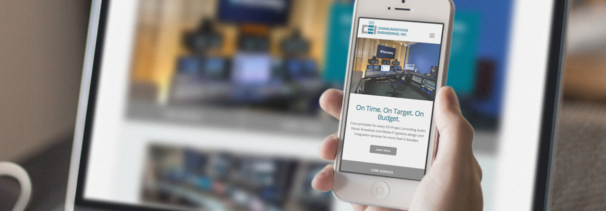
Engineering Company Launches Magnificent Mega Website
Sometimes, you’re comfortable and settled. Sometimes, you’re restless and ready for a big shake-up.
Our long-time client Communications Engineering Inc. (CEI) was definitely ready for a change. Like a cluttered house, their website needed serious remodeling. It had too much content and too little organization. If customers can’t navigate your site, they’re not likely to stick around long enough to give you their business. That’s why ACS Creative stepped in to reorganize, redesign and revitalize CEI’s web presence.
CEI develops and implements broadcast, AV and IT infrastructures. For over 30 years, the company has served some of the world’s most-recognized brands. A leading system integration company, there’s little CEI can’t do. Their team designs board rooms, auditoriums, news studios, classrooms, kiosks and so much more.
So how do you encapsulate all these services into one website, without overwhelming potential customers? ACS Creative tackled this challenge, working closely with CEI to develop an in-depth yet breezy website.
Perfecting the project gallery
Over the years, CEI has developed communications spaces for many clients. They capture gorgeous photos of these meeting halls, sanctuaries, studios and other group spaces. That meant their project gallery, like the rest of their website, would be huge.
ACS created a user-friendly project gallery, without compromising the client’s content. Potential customers sort the projects by type or by market. For instance, if you’re looking for control rooms, a grid of case studies populates seamlessly. If you want the museum market, a new grid of captivating images appears.
So many solutions, so little attention span
CEI needed pages for their core services, audiovisual solutions and broadcast systems. Each solutions page shows how CEI serves their clients and solves their problems. Our graphic designer peppered these pages with carefully chosen images. That way, customers can quickly scan each page without feeling bogged down by paragraphs of text.
Let’s face it – web users have short attention spans. We need to hold their interest and appeal to their laziest instincts. ACS designers make webpages easy to scroll through, so customers never feel like they’re working too hard to get where they need to go.
Mega menu madness

When you have a website this massive, sometimes you need a mega features. Our creative director determined that a mega menu was the best way to organize CEI’s robust site content. A mega menu expands, showcasing a larger drop-down menu than a typical navigation bar could.
The menu is not only mega, but it is also sticky. As users scroll down, the menu sticks to the top of the page. This encourages potential customers to click through more of the website.
Of course, a slick mega menu is not enough. You need to guide customers to where you want them to go on your website. That’s why we incorporated multiple call-to-action buttons on every page of the CEI website. That way, customers can keep clicking to their hearts’ content. This keeps them on the website (and away from CEI’s competitors)!
We’re thrilled to have worked with CEI on their engaging, mega website. We can’t wait to see how their company grows with this gorgeous new site!

