The Psychology Behind Color in B2B Branding: What Actually Converts
B2B Color Psychology Isn’t Just Pretty Pictures—It’s Revenue
Look, we’ve all been there. You land on a B2B website and something just feels… off. Maybe it’s the aggressive red CTA buttons screaming at you, or the neon green that makes you question if this company actually understands enterprise software. Thing is, while B2C brands have been playing the color psychology game for decades, B2B companies are finally waking up to something pretty game-changing: color choices don’t just affect brand perception—they directly impact your bottom line.
And the data? It’s pretty wild when you dig into it.
Recent research shows that B2B buyers form their first impression of your company within 50 milliseconds—that’s faster than you can say “enterprise solution.” What’s driving that split-second judgment? Color. And companies that nail their color psychology strategy are seeing 23% higher conversion rates on their landing pages.
Real talk? That’s not a small bump. That’s the difference between hitting your quarterly targets and scrambling to explain why your “perfectly logical” B2B buyers aren’t converting.
Why B2B Color Psychology Actually Matters More Than You Think
Here’s where it gets interesting (and kinda counterintuitive). We’ve always assumed B2B buyers are these hyper-rational decision-makers who only care about features, specs, and ROI calculations. But guess what? They’re still human. They’re still processing visual information at a subconscious level before their logical brain even kicks in.
The psychology behind this is pretty straightforward—colors trigger emotional responses that either build trust or create friction. And in B2B, trust isn’t just nice to have… it’s everything. You’re asking someone to bet their career on your solution, right?
So when your website hits them with colors that subconsciously scream “unreliable” or “amateur,” you’re fighting an uphill battle before they even read your value prop. Make sense?
Think about the buying process itself. B2B purchases involve multiple stakeholders, longer decision cycles, and way higher stakes than buying a pair of sneakers online. Every touchpoint needs to reinforce competence and reliability—and your color palette is working 24/7 to either support or undermine that message.
What B2B Color Psychology Combinations Are Actually Converting in 2025
Okay, let’s get into the good stuff. What colors are actually moving the needle for B2B conversions right now?
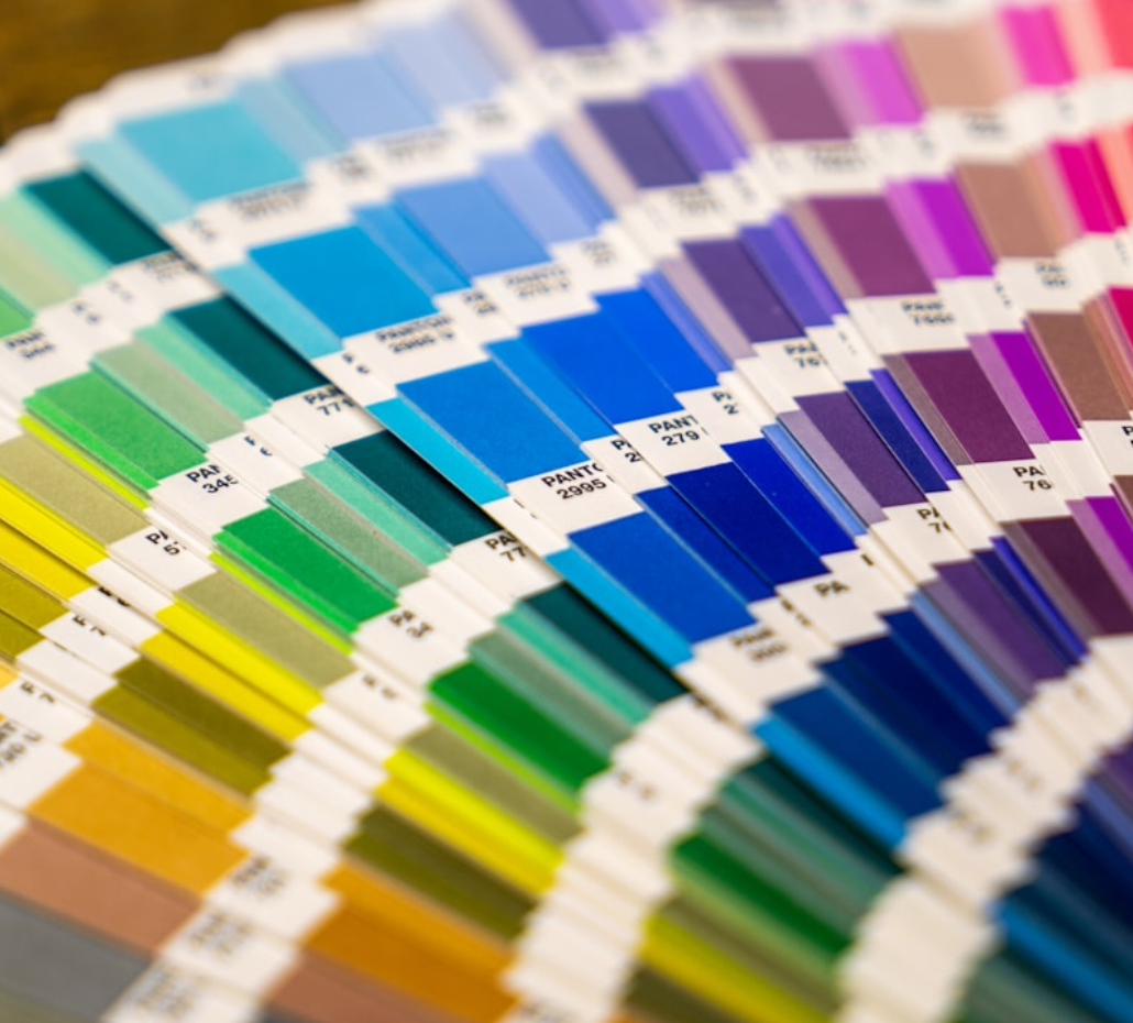
Navy blue and deep gray combinations are still crushing it, but—and this is important—it’s not just about slapping navy blue on everything and calling it professional. The magic happens in the combinations and how you use accent colors strategically.
Financial services companies using deep blues with orange or green accents are converting 31% better than those boring monochromatic schemes everyone defaults to. Technology companies? They’re seeing 28% more form completions with gradient blues paired with strategic white space. And professional services firms using sophisticated gray palettes with purposeful color pops are driving 19% more consultation requests.
But here’s the thing… (and this might surprise you)
The highest-converting combination across industries is actually navy plus orange—with research showing it’s perceived as 34% more trustworthy than other color pairings. Charcoal plus teal is another winner, especially for companies positioning themselves as innovative but reliable.
The data’s pretty clear: strategic color choices aren’t just about looking professional anymore. They’re about triggering specific psychological responses that align with your brand positioning and your audience’s expectations.
The Trust Factor: How B2B Color Psychology Builds Credibility
Look, trust is everything in B2B sales, right? And colors are doing heavy lifting in the trust-building department before your prospects even realize it’s happening.
Recent studies on B2B decision-making revealed that business buyers subconsciously associate specific colors with competency levels. Deep blues signal stability and expertise—which is why you see them everywhere in financial services and enterprise tech. Grays communicate sophistication and neutrality, making them perfect for consulting and professional services.
But here’s where most companies mess up: they think “professional” means “boring.” So they go full grayscale and wonder why their conversion rates are flat.
The companies that are winning? They’re using what I call “trust anchors”—those reliable blues and grays—but they’re adding strategic pops of color that communicate energy, innovation, or approachability depending on their positioning.
You can be trustworthy AND memorable. You just gotta know how to balance it, you know what I mean?
And this connects directly to broader digital strategy trends we’re seeing—authenticity and trust-building are becoming more important than flashy design gimmicks.
Beyond the Basics: Advanced B2B Color Psychology Strategies
So you’ve got your navy-and-orange combo locked down… now what? This is where it gets really interesting, because the most successful B2B brands in 2025 are going way beyond basic color theory.
They’re thinking about color psychology across the entire customer journey. Different stages of the buying process might call for different psychological triggers, right? Top-of-funnel content might use more energetic, attention-grabbing colors, while bottom-of-funnel conversion pages lean into those trust-building blues and grays.
Some companies are even A/B testing color psychology based on company size—using different palettes for enterprise prospects versus SMB leads. Makes sense when you think about it… a startup CEO might respond to different visual cues than a Fortune 500 procurement team.
But here’s something most people don’t think about: accessibility isn’t just good practice—it’s good business. Colors that don’t meet accessibility standards can literally prevent prospects from engaging with your content. And with lawsuits around web accessibility on the rise, this isn’t just about conversions anymore.
Plus, as more B2B interactions move digital (and stay digital), your color choices need to work across devices, platforms, and contexts. That beautiful gradient might look amazing on your desktop monitor, but how’s it performing on mobile? In email? On social media?
Implementing B2B Color Psychology That Actually Drives Results
So how do you actually put this stuff into practice without completely overhauling your entire brand presence?
Start with your highest-traffic conversion pages. Your homepage, key landing pages, pricing pages—these are where color psychology can have the biggest immediate impact. Test different combinations, but test them systematically. Don’t just throw orange buttons on everything and hope for the best.
Document what you learn, because B2B color psychology isn’t one-size-fits-all. Your audience might respond differently than the industry averages, and that’s totally fine. The key is understanding what drives YOUR prospects to action.
And look… don’t forget about context. A color that works great for your SaaS platform might be completely wrong for your white papers or sales presentations. Consistency matters, but so does appropriateness for the medium and the moment in the buyer’s journey.
This kind of strategic thinking extends beyond just color choices—it’s part of developing a comprehensive brand experience that builds trust and drives conversions at every touchpoint.
Real talk though? The companies seeing the biggest wins from B2B color psychology in 2025 aren’t just picking colors—they’re building systematic approaches to visual trust-building that align with their overall positioning and growth goals.
At the end of the day, color psychology in B2B isn’t about manipulation or tricks. It’s about removing friction, building confidence, and creating visual experiences that help your prospects feel good about choosing your solution.
And that? That’s just good business.
Let’s talk about how ACS Creative can help you achieve your goals.

