New Security Training Website Hits the Mark
What does it take to build a good website? What does it take to make a good website great?
As website designers, it’s sometimes tough to know the answers. Our client O’Gara Training came to us with a good, solid website. We helped them make it better. Their new website not only helps customers learn about O’Gara (the key function of any site), but it also sets up the company for future growth and success.
Go with the (user) flow
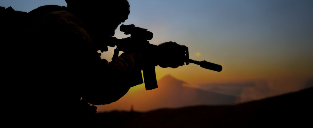
When the O’Gara team came to us, they knew their site wasn’t addressing the needs of all of their customers. The company trains clients on how to manage dangerous scenarios. From highway emergencies to explosions, experienced trainers cover a broad array of crises.
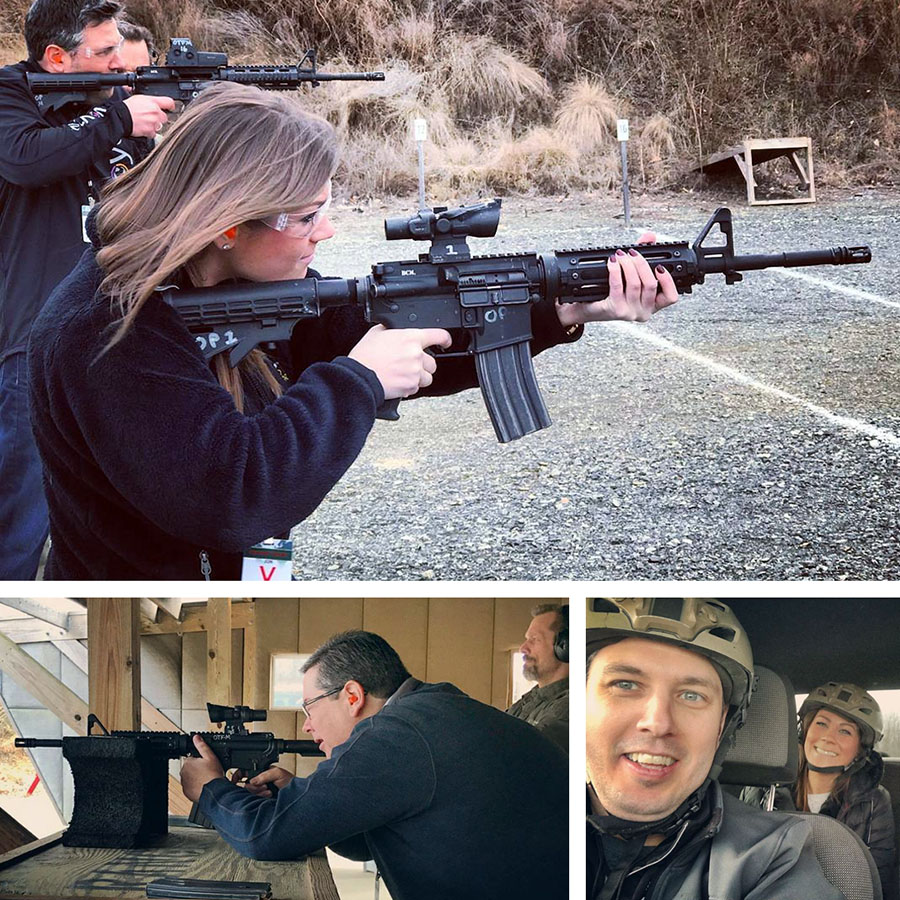
We had a blast (pun intended) when we visited one of O’Gara’s training facilities. Our gracious hosts taught us to shoot firearms and drive on slippery roads. We saw first-hand that these practical courses could help so many people, but their old website focused mostly on military training.
In reality, O’Gara serves NGOs, government contractors, corporate executives and many other non-military clients. With the new website, we had to communicate with these different audiences without alienating any one industry.
Keeping the customer industries in mind, we created specific user flows. A user flow (or conversion path) is the journey someone takes as they navigate a website.
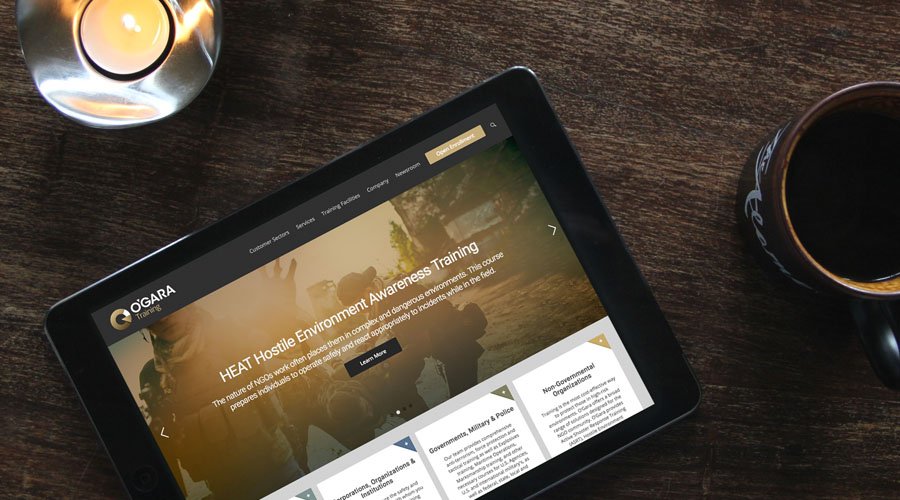
We completely restructured the O’Gara Training website to create these user flows. From the second someone lands on the new website, they are led to pages specifically designed for their needs. The homepage has four neat blocks for each customer sector: Individuals; Corporations, Organizations & Institutions; Governments, Military & Police; and Non-Governmental Organizations. Each audience has a custom webpage, addressing the unique security needs of their industry.
![]()
New logo for new markets
To complement these new user flows, we refreshed the O’Gara Training brand. Their old logo had a strong military feel, with its green color and traditional serif font. The new logo had to attract military and non-military industries at the same time.
Our designers created a modern logo for O’Gara, with a clean sans serif font and a neutral brown color. It communicates the serious tone of O’Gara’s business, while appealing to a broader array of customers.
We incorporated this logo and brand scheme throughout the new website. We also designed a PowerPoint presentation and email to support the renewed brand. All of the branded marketing materials work together to deliver a cohesive message to customers.
The new brand also helps distinguish O’Gara Training from its parent company, The O’Gara Group. The training division now has room to grow beyond the company’s security roots to branch into more commercial sectors.
Laying the groundwork for growth
Websites tell customers who you are. They also tell customers who you want to be. We built the O’Gara Training website to help the company expand down the road. Our developers included back-end tools to allow O’Gara to easily add new services to the website any time.
The old website put their training facilities front and center. But we all know physical locations don’t matter as much anymore thanks to digital technology. The new website focuses more on services and customers, rather than locations. That way, O’Gara can offer online courses, without needing to connect the course to a physical training center.
We’re proud to have been apart of O’Gara Training’s new website. We hope to visit their training grounds again soon, and we’re excited to see how the new brand helps their business grow.
Ready for a New Website?
If your site could use a new look, get in touch. We can take websites from good to great. Let’s have a conversation!
"*" indicates required fields